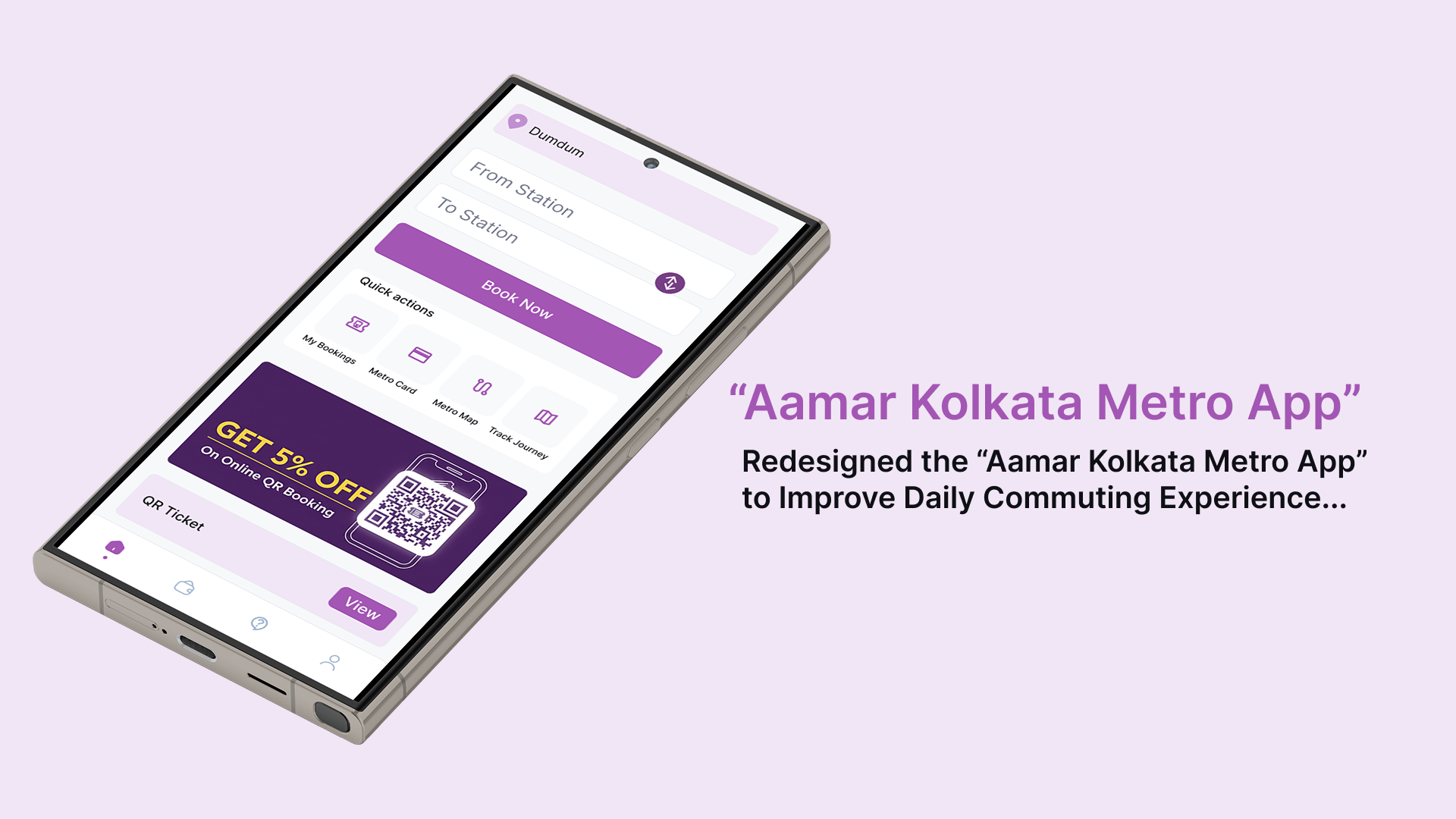
Amar Kolkata Metro — App Redesign
Making ticket booking faster, clearer, and more confidence-inspiring for everyday commuters.
- Role
- UX/UI Designer
- Duration
- Personal case study
- Tools
- Figma, FigJam, Pen & paper
When “working” isn’t good enough
The Amar Kolkata Metro app did its job — technically. Users could book a ticket, check a route, and make a payment. But for thousands of commuters relying on it every day, functional was not enough.
The app was slow to navigate, confusing to use, and filled with repetitive steps that turned a simple ticket booking task into a frustrating experience.
The real question was not: can users complete the task? It was: why does it take so long, and why do users feel unsure along the way?
My goal was clear: make the app fast, clear, and confidence-inspiring, so a commuter rushing to catch a train could book a ticket without a second thought.
Listening to the commuter
As a frequent Kolkata Metro traveler myself, I started with firsthand experience — the friction, confusion, and moments where the app slowed me down. But personal experience was only the starting point.
Research methods
- Personal observation and lived experience as a regular app user
- Conversations with fellow commuters and peer groups
- Qualitative feedback through informal discussions
- Quantitative inputs from app store reviews and surveys
Target users
From the research, I identified a core user age range of 17 to 40 years, mainly including college students and working professionals.
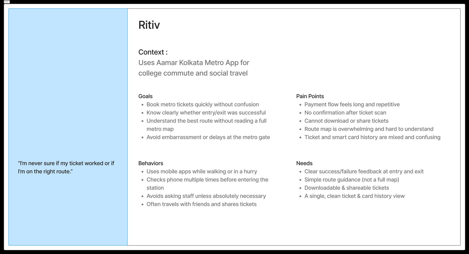
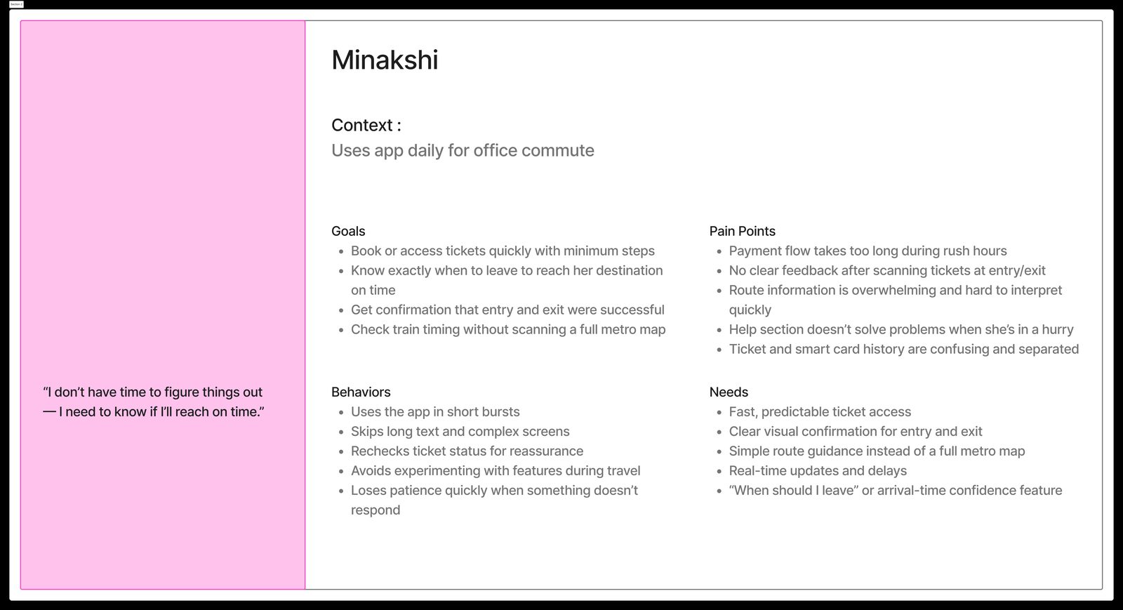
Personas
These personas helped me ground every design decision in real human needs, not assumptions.
Key findings
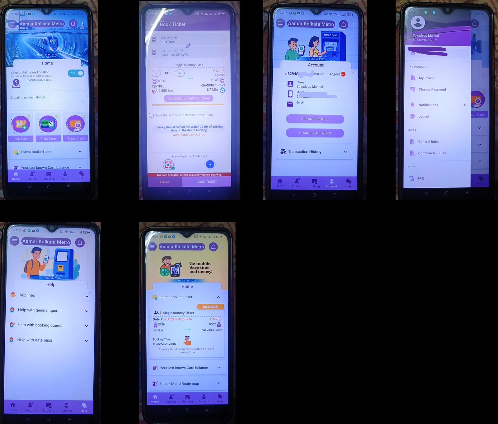
- Confusing interface and poor visual hierarchy — users did not know where to look or what to do first.
- Lengthy and repetitive booking and payment flow — too many steps created unnecessary friction.
- Poor feature organization and lack of feedback — important features were buried, and users felt uncertain about whether actions had worked.
The design process: from sketch to system
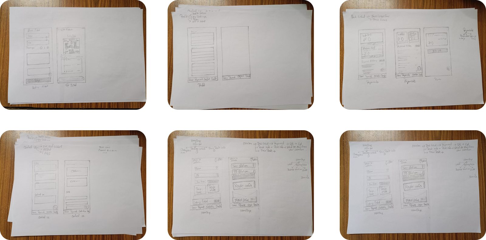
Sketching and ideation
I started with pen and paper to rapidly explore the problem space and push through early ideas. This low-commitment phase helped me iterate quickly, reject weak solutions early, and identify stronger directions.
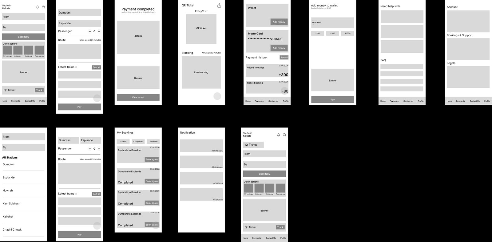
Mid-fidelity wireframes
Next, I moved into digital mid-fidelity wireframes to structure the content and layout more clearly. This stage was still exploratory — I continued refining the information architecture and focused on layout logic instead of visual polish.
Competitor analysis
In parallel, I studied comparable apps such as Delhi Metro, Namma Metro, and ride or ticket booking apps. This helped me understand common design patterns, benchmark the redesign, and avoid repeating poor interaction choices.
Design system
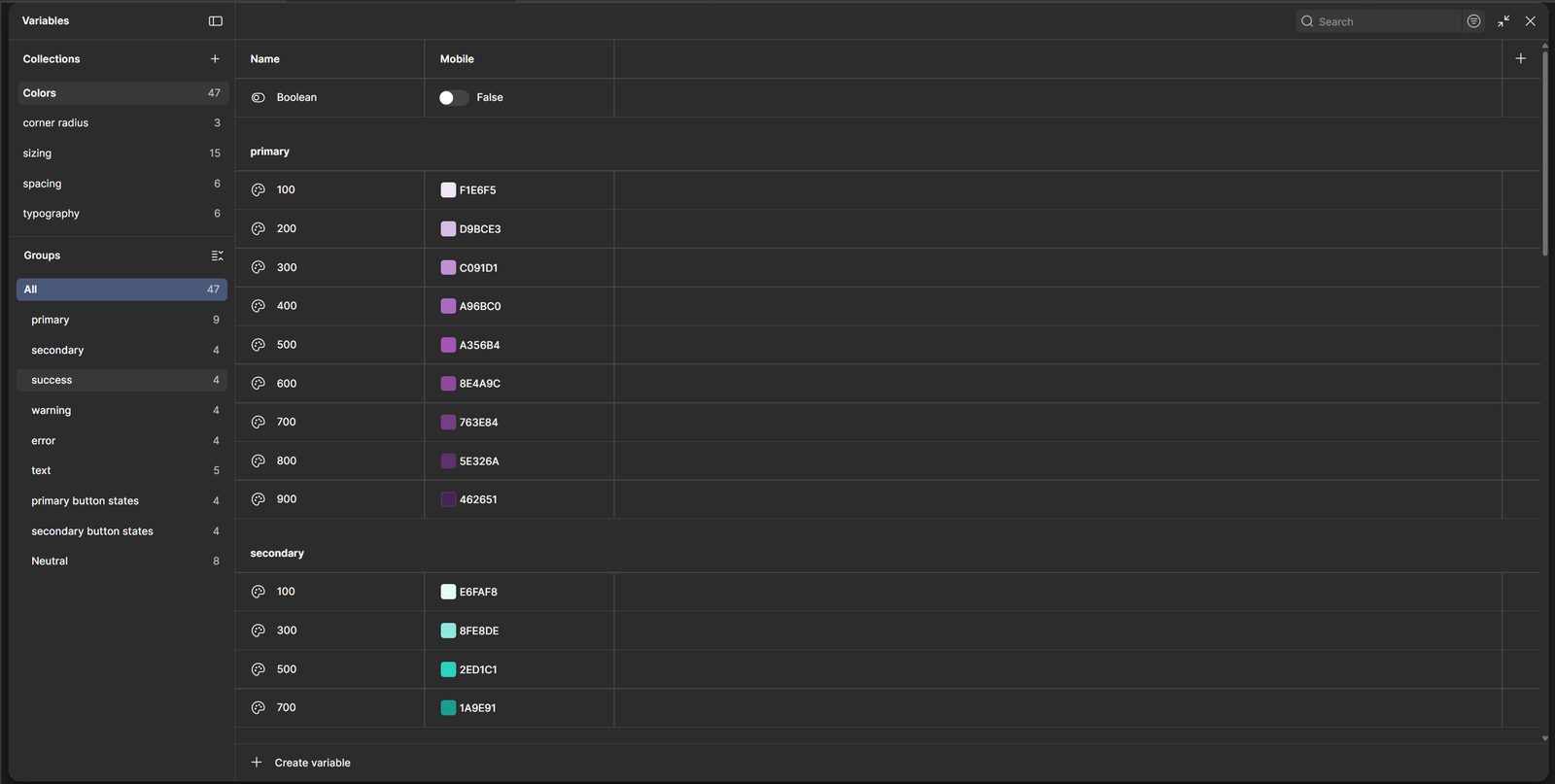
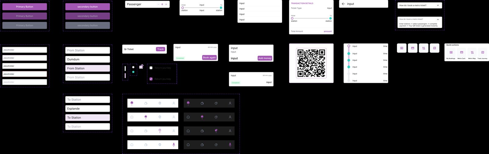
Before moving to high fidelity, I built a design system that made the final design more cohesive, scalable, and maintainable.
- Primitive and semantic tokens
- A consistent color palette
- Typography scale
- Spacing rules
- Reusable components
Prototypes and iteration: refining through feedback
With the design system in place, I built a high-fidelity interactive prototype. Each screen was reviewed against the original pain points, and I iterated through feedback before moving into user testing.
Iteration flow
- Early sketches
- Mid-fidelity layouts
- Design system
- High-fidelity screens
- Interactive prototype
At each stage, I asked
Solutions that did not support the core goals were removed, even if they seemed promising at first.
- Does this reduce friction?
- Is this faster?
- Does this feel clear?
- Does the user know what happened after an action?
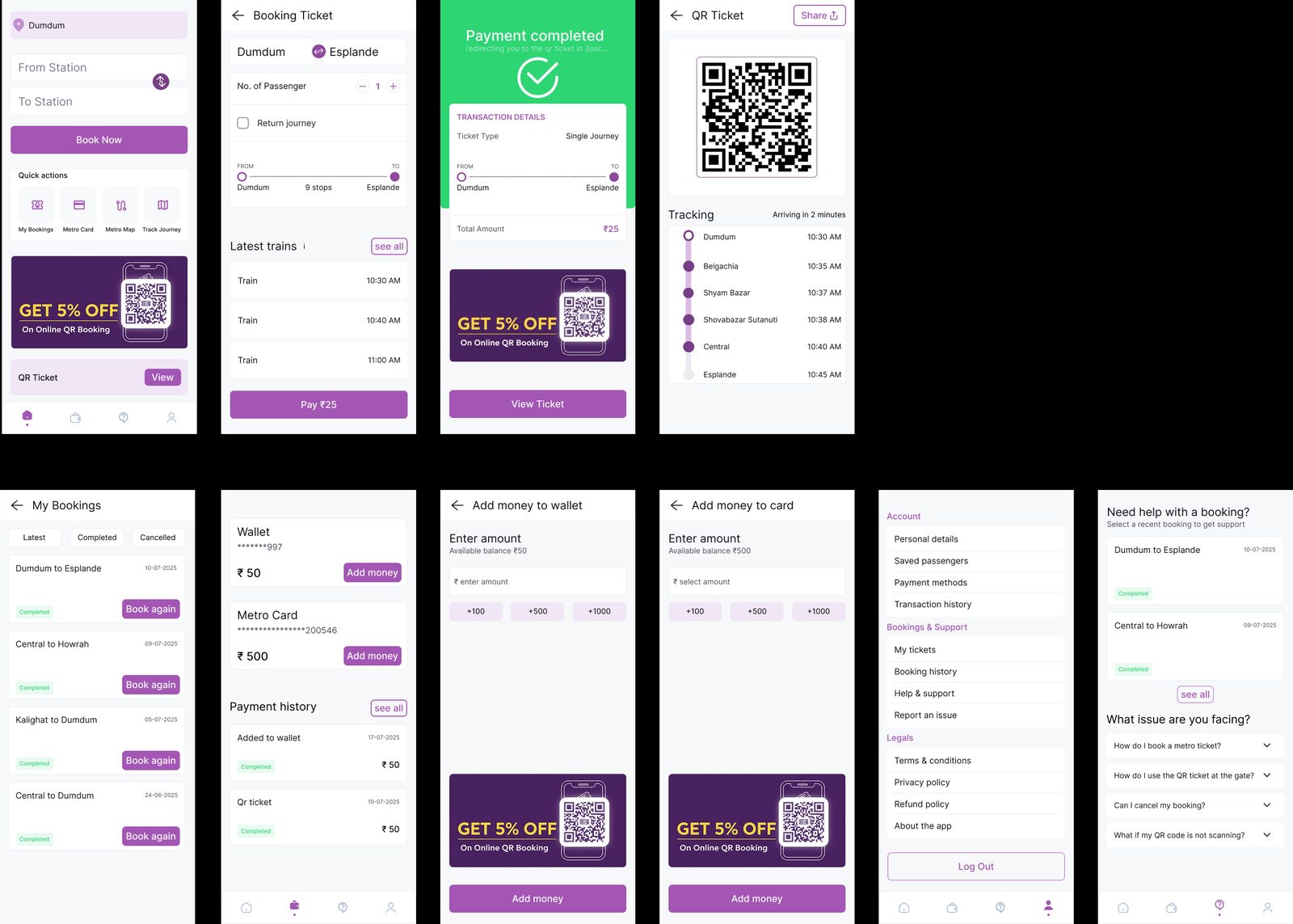
Impact: faster, clearer, more confident
I tested the interactive prototype with friends who regularly use the Amar Kolkata Metro app. The feedback was consistently positive.
Testing feedback
- Users reported being able to book tickets noticeably faster than with the original app.
- The redesigned flow felt clearer and less overwhelming.
- Users expressed greater confidence while completing actions.
- Overall satisfaction with the experience improved.
The redesign showed that a transit app does not need to be complicated to feel complete. By reducing confusion and focusing on what commuters actually need — a fast, confident path to their next journey — the experience changed from something users tolerated into something that genuinely worked for them.
Final reflection
This project helped me understand that good UX is not only about adding features. It is about removing doubt, reducing effort, and helping users move through important tasks with confidence. For the Amar Kolkata Metro app, the biggest opportunity was not to redesign everything visually — it was to make the core experience, booking and using a ticket, feel faster, simpler, and more reliable.
Designed by Ayan Parui — UX Designer, Kolkata
Like what you see?
I'm open to UX/UI roles, freelance projects, and collaborations. Let's talk about what I can bring to your team.
Get in touch